Tuesday 6 January 2015

2 DIMENSIONAL DESIGN>>5th ASSIGNMENT- PAINTING TO MUSIC

PAINTING TO MUSIC
Basically is a new experience to me, never did this kind of drawing before. This what I paint for the first section. I did not have any idea at first, so I put my hand on the paper and then a few circles came out. Later, I started to paint. While listening to modern music, there are some sad song and some happy song, so I painted with bright colours and also grey and the black background. 
Have a closer look. I like how the lines flow. I used graphite pencil, water colour, poster colour, and water colour pencil.

We have classical music for the second section. I'm more comfortable with classical music as you can see the differences between the first section work piece. the first one is freedom and untidy. This one is calm and neat. Through this assignment, I realized that how music affected our feelings and thinking, this is a great experience! Thank you.

Sunday 4 January 2015

2 DIMENSIONAL DESIGN>>4th ASSIGNMENT- MONOGRAM

MONOGRAM

These are my very first designs of my monogram. I was a bit lost.
 After looking at previous students' work, I got what Ms. Mas Lisa wants us to do. I started to create something different.
Guess which one I chose for my monogram?
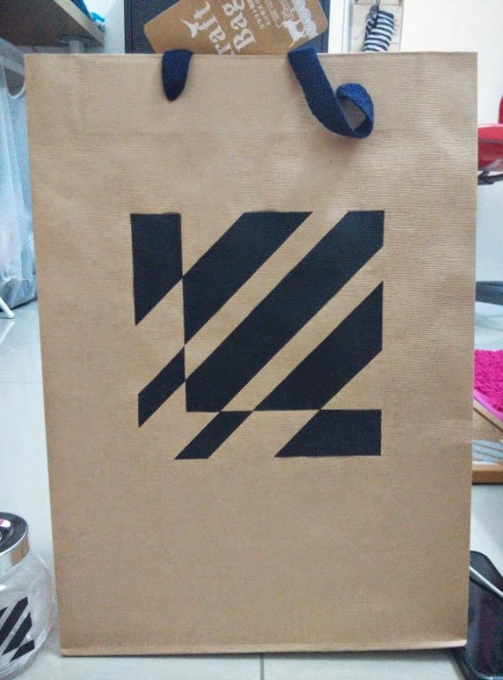
TADA! This is the final decision. The letter ''E'' and ''L'' from Ester Liang. Finalized it on graph paper then started to cut stencil for printing used.
I cut few of them to print my 6 things and poster.
To print on fabric and paper, Acrylic is better.
Put acrylic on a make-up sponge and then press softly on the surface, continue this action untill the colour apply on there evenly.
Each part have to apply at least twice. If not, the white still cannot fully covered the black of the mounting board.
I sprayed a bit silver colour on the top part so it look like radiance.
notice board (spray paint)

paper bag (spray paint)

poster (acrylic)

saving can (spray paint) and candy bottle (maker pen)
I'm surprised with the outcome, love them so much! Thank you for watching.=)


2 DIMENSIONAL DESIGN>>3rd ASSIGNMENT- BATIK MA

BATIK MAKING
My group members are Angelica, Doris, Jennie and me. At first, our thinking to draw a house, but we felt like this is not what we wanna do, so we changed our design.
This is the sketches of our final decision. As you can see we like cute things!
And then Ms. Mas Lisa brought us to the batik factory with our classmate. We started to draw out the out line with pencil at first. 

Then, the workers lent us the tools to draw with wax. The brownish line are the wax. This is really hard to use, because everything is free drawing and the the wax is hard to control as a beginner. The wax have to hot so we can draw with the melt wax. 
After applying wax, we coloured our cloth. The colouring part is fun! 

TADA! All done after a tiring work.

2 DIMENSIONAL DESIGN>>2nd ASSIGNMENT- PAPER CUTTING

PAPER CUTTING


                  These are my paper cuttings. The theme that I chose is Japanese. The first one is Japanese temple and the fuji mount at the back. The second one is the Japanese money cat.
I drew out the outline of the picture and then carefully cut it out follow the line. Actually the cutting part is no that hard to me because we have paper cutting for last semester too. This time I feel like more comfortable with cutting paper. 
Actually I feel difficult on pasting them to the ''correct place''. The small pieces is very troublesome and easy to lost them. They are also hard to stick on paper because they  are too small.


2 DIMENSIONAL DESIGN>>1st ASSIGNMENT- SELF PORTRAIT

SELF PORTRAIT
     This is my self portrait. The different between the last semester's self portrait is there is no rule for this assignment. We can do anything that represented ourselves, and i chose to do a mask. I think that mask represent a person, somebody, a human. I added on my own feelings into my work. The surface of the mask is not even and it is cracked because it represent my imperfect personality. The wires that twisted around the eyes part means I should not cry anymore, because I used to cry alot in the past.
I put a letter for my parents behind the mask it represent some words that I can't say out to parents.

Friday 15 August 2014

Week 18- greeting card

    Mine is the Christmas series. Breaking out of the frame, I used white and navy mostly so that is kinda different with the normal red and green Christmas card. White and navy also bring a wintery feels, it is not that cute like the red and green Christmas theme but the beautiful of wintery Christmas mood.

 When I was designing these cards, I was thinking about what kind of card I really want to receive. A clean and simple card but it must be beautiful, so I designed them. 
Saw this type of packaging in shopping complex then I copied. Love it with the simple form.
  Front look.
Pull up the ribbon and there's a card for you to write down the message. 
Thank you for viewing my blog.

Week 16- colour wheel

     
     We done the platform at first, we painted in green so it look like grass, and then sticked some dry coconut fiber to decorated. 

      Firstly, melted the sugar.
    Then, added glucose, it won't break it easily. 
    After that, added colour.
    This is me. I used the spoon to made the petals one by one.
   Waited them cool down then carefully took them because they are really thin. 
     Took a wire then sticked them one by one like this.
    I'm arranging them followed the colour wheel. 
We spend whole night doing these. It was tough but we did it. The scars on our fingers is the mark, we will never forgot what we have done. I feel pleasure even now.